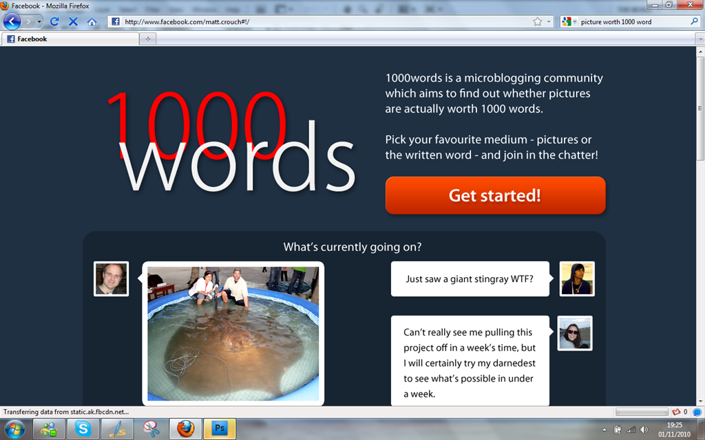
So after giving it a bit of a think, I’ve come up with how this site is going to operate. It’s part social network, part blogging platform (but mostly just a glorified pinboard).
The concept behind the idea for the site is “Are pictures really worth 1000 words?”. Could we get people to write 1000 words for every picture that gets uploaded? It’s a tall order (and most likely heavily weighted on the side of the pictures) but a fun little concept to see how it runs.
The users sign up and pick a side (or get chosen to be on a side depending on what kind of content they upload the most) to play for – the picture takers or story writers – and fight to earn points for their team to see which can be the best platform.
The underlying idea is, of course, to see if we can get 1000 words per photo upload. There will be a counter of “points” somewhere in the site of how many points each team has accrued (say, 1000 points for a photo and 1 point per word in a text entry) and a running ratio of how much a picture is actually worth. I’m going to go with ‘probably less than 1000’, but we’ll see what happens.
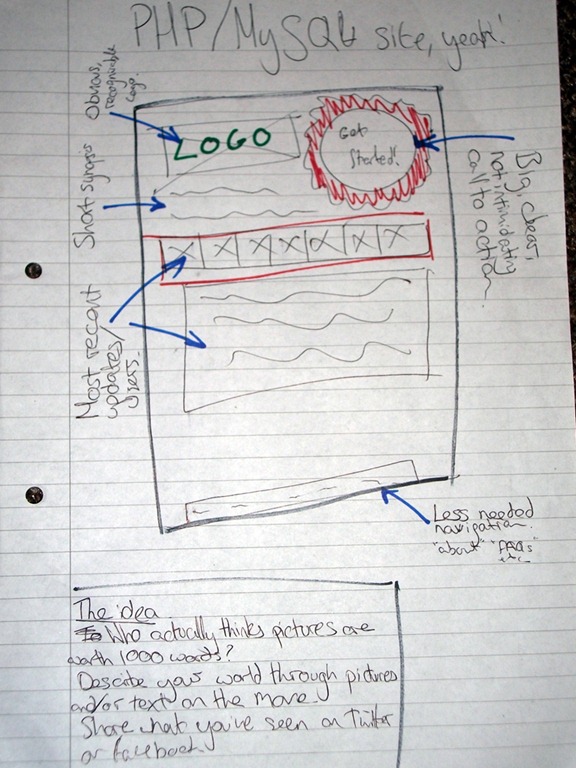
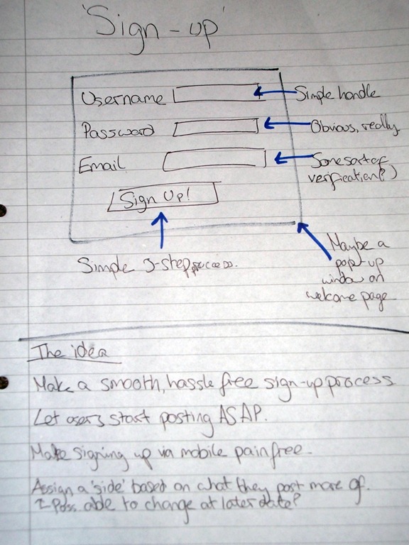
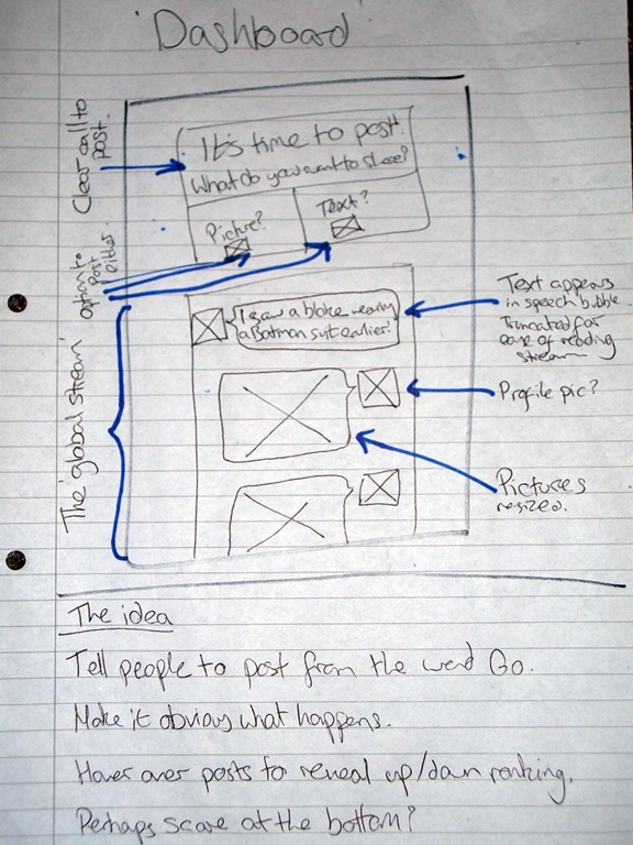
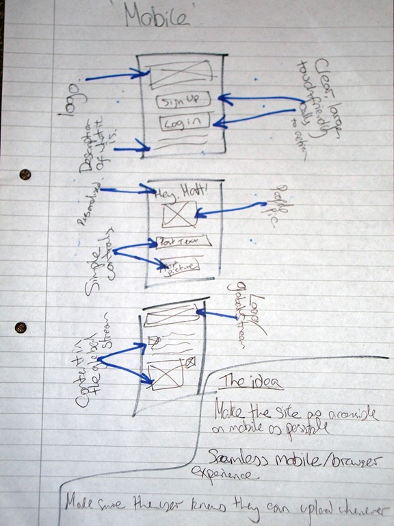
With that idea in mind, and the want to go mobile with this platform, I thought I’d best draw some basic sketches of what I had running through my mind at the time.
In short, what these scribbles are trying to portray is a nice, sleek looking site where it’s obvious what’s going on. Users will be greeted with the ‘global stream’ which essentially the most recent text/image posts there have been, as well as a running count of the score.
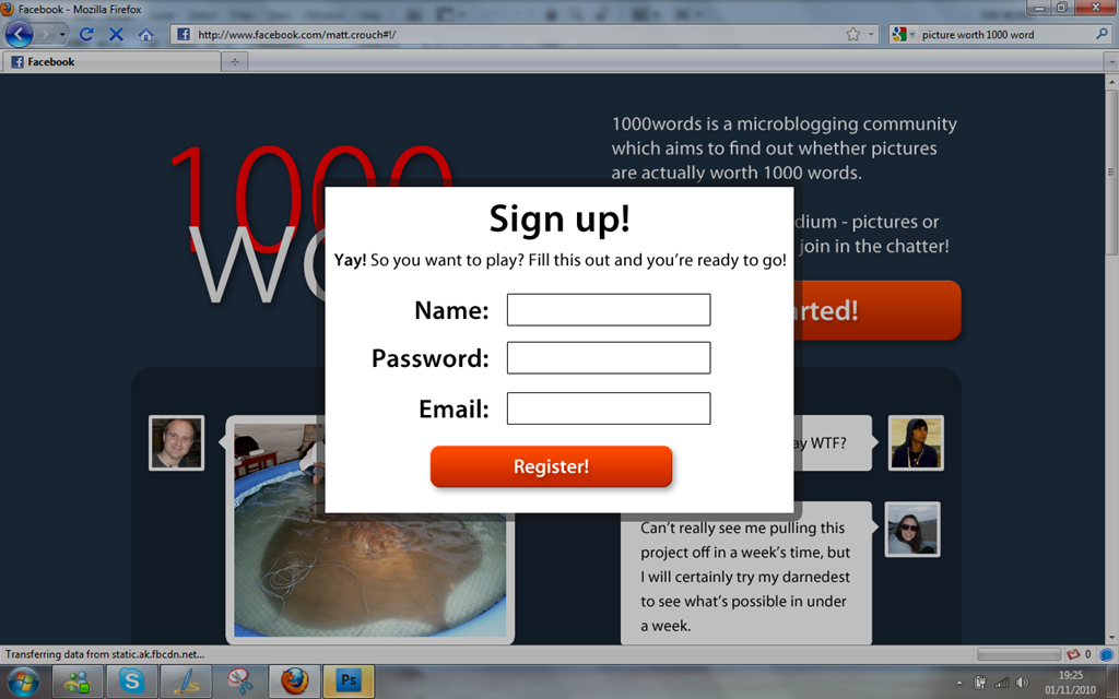
Signing up is made as basic as possible with just a username, password and email required. Other details can be filled out later on, but the idea is just to get the poster started in playing the ‘game’.
The dashboard is a lot like the main page, just now with an obvious choice between uploading a picture or a text post, and the functionality then is a lot like Twitter (and may be integrated with Twitter at a later point) where you just post a response and it pops up on the global stream. Currently there’s no plan to allow replying between people, but there’s always the future…
Lastly it’s the mobile version of the site which hopefully, assuming the main site sticks to the basics, will feature every feature of the desktop experience so they don’t feel like they’re losing out if they use their phones. Only drawback here being that to my knowledge you can’t upload pictures using the browser on iPhones, but you can on Android. Others I’m not sure about, but we’ll cross that bridge when we come to it.
So what does that look like in actual graphical terms? Well, it’s funny you should ask that…
Obviously, it’s just a quick Photoshop mock-up and it will inevitably look completely different when I actually get around to implementing it. It’s just to get a quick feel of how the site will look. It’s got the nice big ‘get started’ button to encourage a bit of participation. (People already logged in will go straight to the dashboard, which would look something like the second half of the homepage anyway).
Time to get building, then!
