It’s that time again, time to design another project. This, the final one of our first term, is HTML5. Obviously, it’s not exactly a ground-breaking technology in terms of coding something awesome but we need to show we can adapt to new standards. What better way to do that than to make something I can showcase my other work on. Win win, no?
Inspiration
Every good design starts with an inspiration, right? Usually, I just leave this to just a spark of genius that comes to me, but a portfolio site really doesn’t have a specific design that lends itself to it perfectly. An image gallery will have priority on the images and a news website will make eye catching headlines. But we need a little bit of everything.
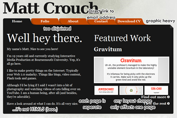
But first, what’s wrong with the current portfolio design?
It’s not too bad – I mean, there’s worse out there – but it’s not seamless enough for me. Every page has it’s own unique page, so if I wanted to change the navigation for example, I would have to edit every individual page.
One kind of big point is that the contact page is actually just a mailto: link. With the new HTML5 form features, we can sort that out I reckon.
But really, it just looks old hat. Maybe because I’ve just seen it so many times now, but the way it’s all boxed in with it’s little folder structure… nah. Not nice. Let’s make this HTML5-y and CSS3-y – and by that, I mean modern.
Little nuggets of genius
So now onto some proper inspiration. I’ve been searching the web for a while now seeing some good examples of HTML5 and CSS3 in people’s work. But I thought I’d best give actual HTML5-based portfolios a looksee and see what they have to offer. Here’s some stuff I like:
This might look a lot like what mine does now, but that’s not their whole site. It just gives a basic overview of what they do. A little snippet to entice you a graphic to catch your eye and a call to action. Simple and effective. No need to actively load a whole page to see if it’s what you want, and that’s exactly the sort of thing I want to achieve. So I’ll need some nifty little slider thing, for sure.
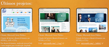
The next problem is that the actual content of my portfolio you need to actively scroll down to see what’s best. This portfolio by interaction designer Icaro Ferracini just presents it in a nice little gallery. There’s about ten different little blocks that clearly show you what he’s capable of and if you click it, it will present a lightbox-style image gallery or video of the project in action. Clean, simple, resourceful.
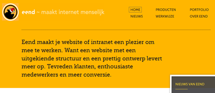
Another common theme which seems to be arising is the use of neutral and bold colours with big text. It’s something I’ve touched on before and it’s something I’m a rather big fan of. The company eend does it very stylishly there. Simple little icon usage helps bring it all together. [The bit in the bottom right is the top of their Twitter feed – something I want to bring into mine, too.
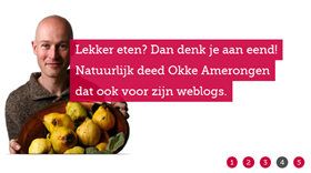
Their site has a simple slider too, which fades in and out of recent work. Looks clean and fits in perfectly with their entire site. It’s certainly an alternative to the one at the top, which can look a bit too aggressive.
The design
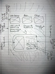
Me being a stickler to old practices, I sketched out a few design ideas that I could implement based on what I’ve seen so far.
There’s the drawn out idea. The one to the right is just a quick amendment I did. I wasn’t sure whether the original way would look too cramped or not, going by the style of the other bits. So I made a version of it that would use the lightbox effect to show more about a project.
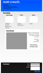
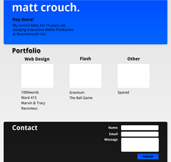
Then I translated that into Photoshop, kind of merging the two together.
The latter looks a little silly, I’m aware, but we would see how it translated online. The first one is more like the original plan. You click a project under the appropriate heading and the content in that box would update and the page would slide down to greet it.
In terms of HTML5-yness, there’s not a lot going on at the moment. It’s only really layout and form validation right now, so I would have to look into it.
The contact bit I’m not sure how it’s going to look nor what contact lines I should put in there, so it’s blank. Sorry about that.
So yeah, I’m aware right now it looks a bit like the default Wordpress theme, but it won’t in the end I hope. The header was orange until right at the very end. So it’s all still very much up in the air. We’ll see how it goes!
