A new term, a new brief. It’s something a little different this time by way of a mobile app. The brief’s pretty lenient in terms of what you can do for it and what platforms it’s made for, so long as it’s done for visitors to an event which doesn’t already have it’s own app.
There was a shortlist of possible places to go for – one of which was Legoland – and it was immediately obvious the little kid inside me wanted to do this one. I’ve often said the best projects I do are ones that are just fun all the time and I can’t see this one being much different.
So what goes into a Legoland app? Who should you target it at? and ultimately, given this project has a deadline of less than a month away, what’s the best platform to punt towards?
Aiming high
When you think of theme parks aimed at kids, there’s only one that really springs to mind – The big D. Disneyland.
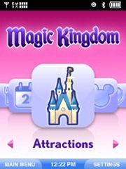
Disneyland’s “Mobile Magic” app is a Verizon exclusive app downloadable from their website prior to attending the park for $1.99. It provides extensive information about all the parks in it’s portfolio like Epcot, Hollywood Studios and Magic Kingdom.
Each park provides wait times for rides, GPS maps for how to get to your favourite ride, tip offs like where Mickey Mouse is hanging out and even a play-along quiz where you try to beat other people playing around the park.
Obviously, a company as big as Disneyland isn’t going to compare to the likes of Legoland Windsor so the app I build certainly doesn’t need to be this complex, but it does bring out a lot of good ideas that can be transferred to my app development.
Aiming alongside
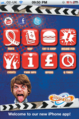
A little closer to home, Thorpe Park’s iPhone-exclusive app is a lot more down to Earth compared to the extravagant Disneyland app. While it shares a few similar features, there’s a couple in there that grabbed my attention.
While the app interface itself is somewhat unassuming, the app packs a few useful features like the usual queue times and park info, but also an interesting section called “Insane Fun” which I’m sure is strictly true, but would relieve at least five minutes of fun when waiting in the queue for a popular ride.
It includes games like “Find the Fathead” – the pseudo-mascots of Thorpe Park – who are hiding in a map of the park and you need to tap them in the quickest possible time. There’s also a list of dares to perform while you’re in the queue for the rides just to annoy the other guests.
There’s also a tonne of social network integration throughout the app, so you can share where you are and what you’re doing which is simple and effective.
This is all well and good but it’s veering close towards early teens rather than Legoland’s primary target of ‘3-12 and their families’.
What comes from this?
Well, I guess I’ve got a lot of work ahead of this deadline next month. I’ve got to be aware that it’s not possible to do every good idea that’s cropped up from the research I’ve done.
But what needs to happen now is to draw up a few plans and navigation ideas to make sure the use of the app is seamless.

