Styling websites used to be so straightforward, right? You created an element, added some styling to a stylesheet and it just worked. I mean, it still does. As the needs of websites have changed over the past few years that approach doesn’t scale any more.
React and other web application frameworks enable many different ways of thinking. Right out of the gate Create React App-powered environments support importing CSS files. There’s a host of other component-based approaches that take the sting out of setting them up - we’ve even covered Fela in a previous tutorial.
In the latest Net Magazine we go over another library with a similar aim called emotion 👩🎤.
Emotion is a library that takes a multi-directional approach to styling - if an app leans a certain way, chances are Emotion has a convenient way to style it. We could pass through a css prop to a component and style it that way, or create new components using the styled template literal syntax. Common stylistic choices can be stuck together like any other string data. There’s even provisions for global styles. Glorious.
While Emotion itself is not tied to React, its where we would see a lot of the benefits. We can create entire new components and use them like any other while never having to do any internal plumbing. It can also be used alongside Create React App without ejecting, which is a huge plus from a maintainability standpoint.
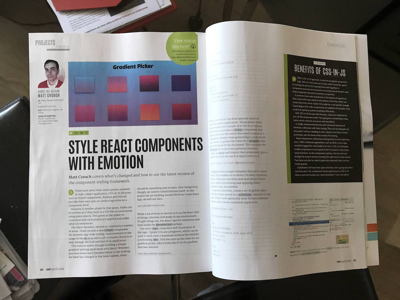
This tutorial walks through how we could make a gradient picker tool. It’s designed more to show off how Emotion can be used with dynamic stylistic data such as those from an array of gradients, as well as styling based on state.
Inside we go through all the major features of Emotion as well as what’s new in its v10 release. There’s plenty in there to chew through to help decide if it’s a good fit for your company’s next project.
There were a couple of features that I ran out of space for in the tutorial itself, but I think they deserve a little honourable mention.
Theming is particularly useful on sites that have multiple different styles, for example a dark theme or high contrast mode. While I would imagine it would be possible to implement something similar with React’s new(ish) Context API it’s nice to have it built into the library itself.
Similarly server-side rendering just works. Like genuinely, no config, out-of-the-box, literally just does the thing. Previous versions had a separate package to deal with it but as of v10 it’s happy enough with react-dom’s renderToString.
If that all sounds interesting, there’s a demo up on my Github that goes over what we’ll be making. The final code is up there too, but if you want a bit more explanation as to what’s going on pick up a copy of Net Magazine and follow along!